fix(ui-buttons): fix ai-secondary button size diff#2617
Conversation


|
Visual regression report
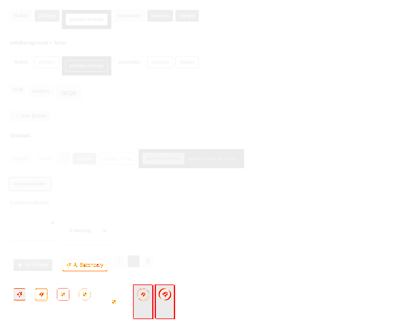
Diff images (1)button-and-derivatives.png — 474230 pixels differBaselines come from the |


|
Nice fix, root cause is spot on and I checked that small/medium/large are pixel-perfect now (both icon and text buttons). Condensed sizes are still off. The fix only kicks in for Add a case to the regression test suite — render the ai-secondary buttons next to the default ones (all sizes) on the button page so the screenshot catches any size drift. Small cleanup on the code itself. Right now the calc is written twice (minHeight + width), the size list is repeated (once as the const aiContentSize =
color === 'ai-secondary' && componentTheme[`${size}Height`]
? `calc(${componentTheme[`${size}Height`]} - ${componentTheme.borderWidth} * 2)`
: undefinedthen use Heads up: this only works because it's spread last and overrides the |

 balzss
left a comment
balzss
left a comment
balzss
left a comment
There was a problem hiding this comment.
see my (and claude's 😺 ) comment
e0ff957 to
0fc74bd
Compare

|
Thanks, the fix and the cleanup is done. |

0fc74bd to
826e59f
Compare
2 participants


INSTUI-5061
Summary
An ai-secondary button was 2px taller (and, for icon-only buttons, 2px wider) than the same button in any other color.
ai-secondary removes the real border and renders its gradient "border" as a ::before ring whose space is reserved by padding. That padding is additive to the content's full minHeight, adding 2px to the outer size.
The fix shrinks the ai-secondary content box by 2 × borderWidth (height, plus width for icon-only buttons), so the reserved padding is compensated and the outer size is identical regardless of color.
Update (review feedback)
aiSecondaryContentSizeconst.Test:
Verify that the buttons have the same size.