A modern, professional, customizable Material-style alert dialog library for Flutter.


KAlertFlutter is a lightweight, modern, and professional alert dialog package for Flutter.
It is inspired by the native Android Java library KAlertDialog and brings a similar beautiful dialog experience to Flutter apps.
With KAlertFlutter, you can quickly create:
- Success dialogs
- Error dialogs
- Warning dialogs
- Info dialogs
- Question dialogs
- Confirm dialogs
- Prompt/input dialogs
- Progress/loading dialogs
- Custom image dialogs
- URL image dialogs
- Custom view dialogs
- WebView dialogs
- Terms and Privacy Policy dialogs
- Modern styled dialogs
- Dark mode friendly dialogs
- Input validation dialogs
- Fully customizable button dialogs
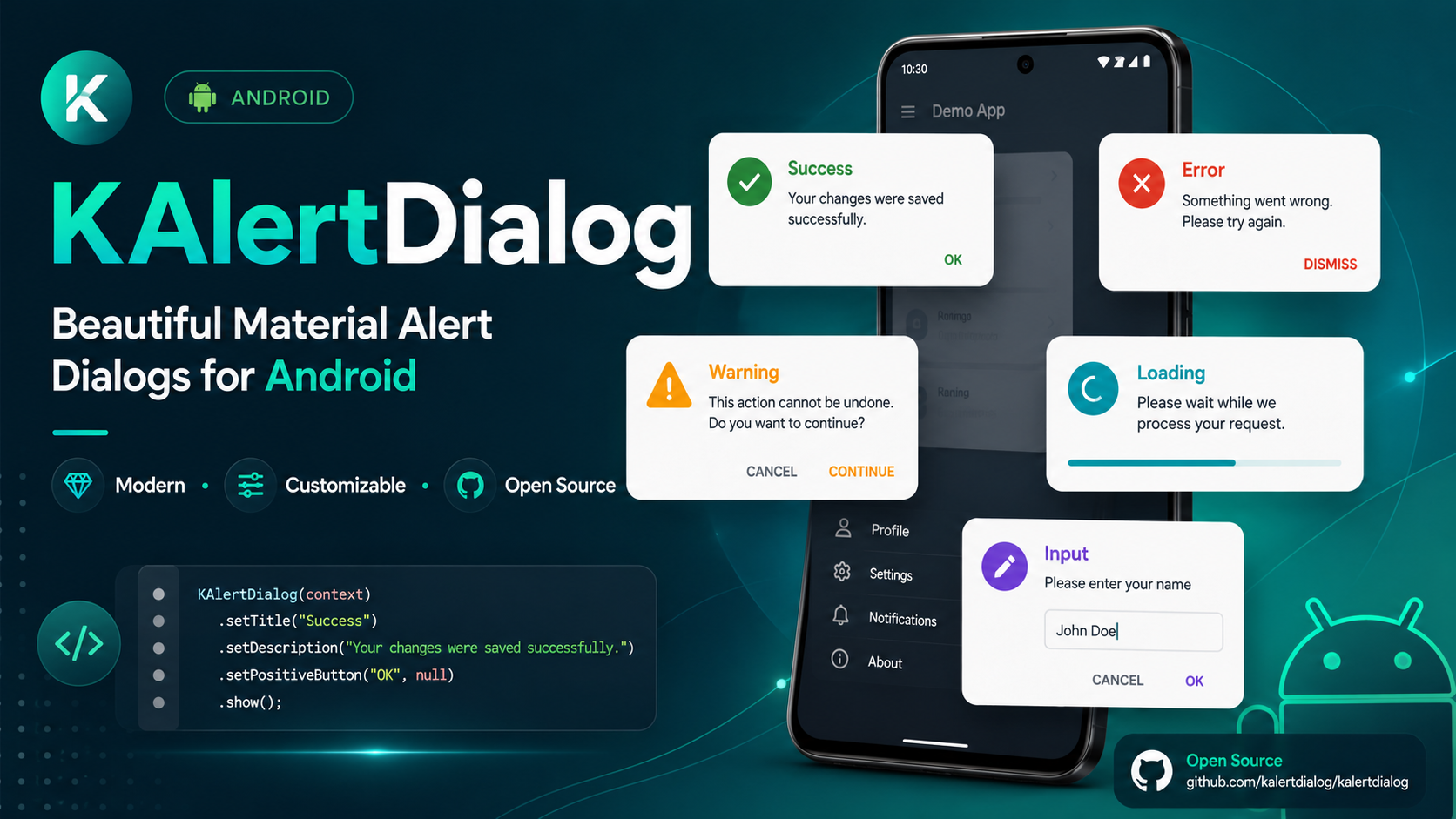
KAlertFlutter is designed to match the native Android Java library KAlertDialog.
If you are building a native Android app in Java, use the Android version here:
Native Android Java Library:
https://github.com/TutorialsAndroid/KAlertDialog
If you are building websites, landing pages, dashboards, or JavaScript projects, you can use the web version of this library:
🚀 KAlert.js brings the same modern dialog experience to Web and JavaScript projects.
Create beautiful JavaScript dialogs including success, error, warning, info, question, confirm, prompt, progress, image, custom HTML, and WebView iframe dialogs.
Visit Website · View on GitHub · View on jsDelivr
<script src="https://cdn.jsdelivr.net/gh/TutorialsAndroid/KAlert@v2.0.0/kalertdialog.js"></script>| Library | Platform | Package | WebView Support |
|---|---|---|---|
| KAlertDialog | Native Android Java | Maven Central | Native Android WebView |
| KAlertFlutter | Flutter / Dart | pub.dev | Flutter WebView |
| KAlert.js | Web / JavaScript | jsDelivr CDN | iframe WebView dialog |
https://pub.dev/packages/kalertflutter
If you find KAlertFlutter useful, please support the project:
⭐ Star this repository
🐛 Report issues
💡 Suggest new features
📦 Like the package on pub.dev
🚀 Share it with other Flutter developers
Follow me on Instagram for more developer content:
📸 https://instagram.com/coderx09
If this library helps you, please consider supporting my open-source work.
Thanks for your support! 🚀
- ✅ Normal dialog
- ✅ Success dialog
- ✅ Error dialog
- ✅ Warning dialog
- ✅ Info dialog
- ✅ Question dialog
- ✅ Confirm dialog
- ✅ Prompt/input dialog
- ✅ Progress/loading dialog
- ✅ Custom image dialog
- ✅ URL image dialog
- ✅ Custom view dialog
- ✅ WebView dialog
- ✅ Terms and Privacy Policy dialog
- ✅ Modern Material-style UI
- ✅ Rounded dialog corners
- ✅ Modern style presets
- ✅ Classic style preset
- ✅ Minimal style preset
- ✅ Rounded style preset
- ✅ Custom dialog corner radius
- ✅ Custom dialog elevation
- ✅ Custom dialog dim amount
- ✅ Dark mode support
- ✅ Custom title text style
- ✅ Custom content text style
- ✅ Title font weight support
- ✅ Content font weight support
- ✅ Button font weight support
- ✅ Button text size support
- ✅ Button all-caps control
- ✅ Custom button colors
- ✅ Custom icon colors
- ✅ Custom background colors
- ✅ Input validation
- ✅ Input max length
- ✅ Input keyboard type
- ✅ Input confirm callback
- ✅ Custom Flutter widget inside dialog
- ✅ WebView inside dialog
- ✅ Hosted web page loading
- ✅ WebView loading progress
- ✅ Center WebView loading spinner
- ✅ WebView page started callback
- ✅ WebView page finished callback
- ✅ WebView page error callback
- ✅ WebView navigation request callback
- ✅ JavaScript enable/disable support
- ✅ WebView zoom enable/disable support
- ✅ Main-frame-only WebView error handling
- ✅ URL image big mode
- ✅ URL image circle mode
- ✅ URL image placeholder
- ✅ URL image error widget
- ✅ Progress dialog
- ✅ Show callback
- ✅ Dismiss callback
- ✅ Confirm callback
- ✅ Cancel callback
- ✅ Backward compatible old API
Add your screenshots inside the
art/new/folder using the same file names shown below.
Modern Success Dialog
|
Custom Radius, Elevation and Dim
|
Title and Content Font Weight
|
||
Basic Message Dialog
|
Error Dialog
|
Warning Confirm / Cancel Flow
|
Info Dialog
|
Question Dialog
|
Input Dialog with Validation
|
Custom View Dialog
|
|||
Custom Image Dialog
|
URL Image Circle Dialog
|
Big URL Image Dialog
|
||
Button Styling
|
Progress Dialog
|
Show and Dismiss Callbacks
|
||
WebView Terms and Privacy Dialog
|
Add this to your pubspec.yaml:
dependencies:
  kalertflutter: ^2.1.0
Then run:
flutter pub getKAlertFlutter includes WebView dialog support for showing hosted pages such as Terms and Conditions, Privacy Policy, Refund Policy, Help pages, FAQ pages, and documentation pages inside a dialog.
For Android apps, add Internet permission in:
android/app/src/main/AndroidManifest.xmlPlace it above the <application> tag:
<uses-permission android:name="android.permission.INTERNET" />For best compatibility, use secure HTTPS URLs:
url: 'https://example.com/privacy-policy'Avoid using http:// URLs unless your app is configured for cleartext traffic.
import 'package:kalertflutter/kalertflutter.dart';KAlertDialog.success(
context: context,
title: 'Success',
content: 'Your changes were saved successfully.',
confirmText: 'Done',
);KAlertFlutter supports these dialog types:
KAlertType.normal
KAlertType.success
KAlertType.error
KAlertType.warning
KAlertType.info
KAlertType.question
KAlertType.progress
KAlertType.input
KAlertType.customImage
KAlertType.urlImage
KAlertType.customView
KAlertType.webViewKAlertFlutter includes modern style presets:
KAlertStyle.classic
KAlertStyle.modern
KAlertStyle.minimal
KAlertStyle.rounded
Example:
KAlertDialog.show(
  context: context,
  title: 'Modern Dialog',
  content: 'This dialog uses the modern style preset.',
  type: KAlertType.normal,
  style: KAlertStyle.modern,
);KAlertDialog.success(
context: context,
title: 'Success',
content: 'Your action was completed successfully.',
confirmText: 'OK',
);KAlertDialog.error(
context: context,
title: 'Oops...',
content: 'Something went wrong. Please try again.',
confirmText: 'Try Again',
);KAlertDialog.warning(
context: context,
title: 'Are you sure?',
content: 'This action cannot be undone.',
confirmText: 'Confirm',
cancelText: 'Cancel',
);KAlertDialog.info(
context: context,
title: 'Information',
content: 'Here is some useful information.',
confirmText: 'Got it',
);final result = await KAlertDialog.question(
context: context,
title: 'Continue?',
content: 'Do you want to continue with this action?',
confirmText: 'Yes',
cancelText: 'No',
);
if (result?.confirmed == true) {
debugPrint('User selected yes');
}final result = await KAlertDialog.warning(
context: context,
title: 'Delete this file?',
content: 'This action cannot be undone.',
confirmText: 'Delete',
cancelText: 'Cancel',
);
if (result?.confirmed == true) {
KAlertDialog.success(
context: context,
title: 'Deleted',
content: 'The file has been deleted successfully.',
);
} else if (result?.cancelled == true) {
KAlertDialog.error(
context: context,
title: 'Cancelled',
content: 'Your file is safe. No changes were made.',
);
}KAlertDialog.progress(
context: context,
title: 'Processing',
content: 'Please wait while we prepare your request.',
barrierDismissible: false,
);Example with auto close:
KAlertDialog.progress(
  context: context,
  title: 'Processing',
  content: 'Please wait while we prepare your request.',
  barrierDismissible: false,
);
await Future.delayed(const Duration(seconds: 3));
if (context.mounted) {
Navigator.of(context).pop();
KAlertDialog.success(
context: context,
title: 'Completed',
content: 'Your request has been completed successfully.',
);
}final result = await KAlertDialog.input(
context: context,
title: 'Create Project',
content: 'Enter a project name with at least 3 characters.',
hintText: 'Project name',
initialValue: 'KAlertFlutter',
maxLength: 30,
validator: (input) {
if (input.trim().length < 3) {
return 'Project name must be at least 3 characters';
}
return null;
},
onInputConfirm: (input) {
debugPrint('Created: $input');
},
);
if (result?.confirmed == true) {
debugPrint('Input value: ${result?.value}');
}You can place any Flutter widget inside the dialog.
final controller = TextEditingController();

KAlertDialog.customView(
  context: context,
  title: 'Custom View',
  content: 'This dialog uses your own custom Flutter widget.',
  showCancelButton: true,
  confirmText: 'Save',
  cancelText: 'Cancel',
  child: Column(
    mainAxisSize: MainAxisSize.min,
    children: [
      TextField(
        controller: controller,
        decoration: const InputDecoration(
          labelText: 'Project name',
          hintText: 'Example: KAlertFlutter Pro',
          border: OutlineInputBorder(),
        ),
      ),
      const SizedBox(height: 10),
      const Text(
        'You can place any custom widget inside KAlertFlutter.',
        textAlign: TextAlign.center,
      ),
    ],
  ),
  onConfirm: () {
    debugPrint('Saved: ${controller.text}');
  },
);KAlertFlutter supports WebView dialogs for showing hosted web pages directly inside a dialog.
This is useful for:
- Terms and Conditions
- Privacy Policy
- Refund Policy
- Help pages
- FAQ pages
- Documentation pages
- Hosted HTML content
- Any web page that should open without leaving the app
final result = await KAlertDialog.webView(
  context: context,
  title: 'Terms & Privacy Policy',
  content: 'Please read our terms and privacy policy before continuing.',
  url: 'https://policies.google.com/privacy',
  webViewHeight: 420,
  showHorizontalProgress: true,
  showCenterLoader: true,
  javaScriptEnabled: true,
  enableZoom: false,
  showCancelButton: true,
  confirmText: 'I Agree',
  cancelText: 'Cancel',
  onPageStarted: (url) {
    debugPrint('WebView started: $url');
  },
  onPageFinished: (url) {
    debugPrint('WebView finished: $url');
  },
  onProgress: (progress) {
    debugPrint('WebView progress: $progress');
  },
  onPageError: (error) {
    debugPrint('WebView error: ${error.description}');
  },
);

if (result?.confirmed == true) {
  debugPrint('Accepted');
}You can control which URLs are allowed to load inside the dialog.
final result = await KAlertDialog.webView(
  context: context,
  title: 'Privacy Policy',
  content: 'Please read the privacy policy before continuing.',
  url: 'https://example.com/privacy-policy',
  webViewHeight: 420,
  showCancelButton: true,
  confirmText: 'Accept',
  cancelText: 'Cancel',
  onNavigationRequest: (request) {
    if (request.url.startsWith('https://example.com')) {
      return NavigationDecision.navigate;
    }

    return NavigationDecision.prevent;
  },
);KAlertDialog.webView()
KAlertDialog.showWebView()Available options:
url: 'https://example.com/privacy-policy'
title: 'Terms & Privacy Policy'
content: 'Please read the page before continuing.'
confirmText: 'I Agree'
cancelText: 'Cancel'
webViewHeight: 420
showHorizontalProgress: true
showCenterLoader: true
javaScriptEnabled: true
enableZoom: false
showCancelButton: true
showConfirmButton: true
showIcon: true
showCloseButton: false
progressColor: Colors.blue
onWebViewCreated: (controller) {}
onProgress: (progress) {}
onPageStarted: (url) {}
onPageFinished: (url) {}
onPageError: (error) {}
onNavigationRequest: (request) {}Some websites may fail to load small internal resources such as favicon, analytics scripts, CSS, images, iframes, or tracking resources.
KAlertFlutter handles this professionally by reporting WebView errors only when the main page fails to load. This prevents false error messages when the actual page is already visible to the user.
KAlertDialog.customImage(
context: context,
title: 'Custom Image',
content: 'You can show an asset image, memory image or network image provider.',
image: const AssetImage('assets/logo.png'),
confirmText: 'OK',
);Using network image provider:
KAlertDialog.customImage(
context: context,
title: 'Custom Image',
content: 'This image uses NetworkImage.',
image: const NetworkImage('https://example.com/image.png'),
);KAlertFlutter supports two URL image display types:
KAlertImageType.big
KAlertImageType.circleKAlertDialog.urlImage(
context: context,
title: 'Big URL Image',
content: 'This image is loaded from a URL.',
imageUrl: 'https://example.com/image.png',
imageType: KAlertImageType.big,
confirmText: 'Close',
);KAlertDialog.urlImage(
context: context,
title: 'Circle URL Image',
content: 'This image is shown in circle crop mode.',
imageUrl: 'https://example.com/image.png',
imageType: KAlertImageType.circle,
confirmText: 'Nice',
);KAlertDialog.show(
context: context,
title: 'Custom Appearance',
content: 'This dialog has custom radius, elevation and dim amount.',
type: KAlertType.normal,
style: KAlertStyle.modern,
cornerRadius: 30,
elevation: 20,
dimAmount: 0.60,
backgroundColor: Colors.white,
confirmText: 'Looks Good',
);Available appearance options:
cornerRadius: 30
elevation: 20
dimAmount: 0.60
maxWidth: 360
backgroundColor: Colors.white
titleColor: Colors.black
contentColor: Colors.grey
iconColor: Colors.greenKAlertDialog.show(
context: context,
title: 'Font Weight Support',
content: 'You can control title, content and button font weights.',
type: KAlertType.normal,
style: KAlertStyle.modern,
titleFontWeight: FontWeight.w900,
contentFontWeight: FontWeight.w500,
confirmButtonFontWeight: FontWeight.w900,
titleTextSize: 22,
contentTextSize: 15,
buttonTextSize: 15,
confirmText: 'Awesome',
);KAlertDialog.show(
context: context,
title: 'Button Styling',
content: 'This example shows button text size, font weight, all caps control and custom colors.',
type: KAlertType.normal,
style: KAlertStyle.minimal,
showCancelButton: true,
confirmText: 'Accept',
cancelText: 'Decline',
confirmButtonColor: const Color(0xFF10B981),
cancelButtonColor: const Color(0xFFE2E8F0),
cancelTextColor: const Color(0xFF334155),
confirmButtonFontWeight: FontWeight.w900,
cancelButtonFontWeight: FontWeight.w900,
buttonTextSize: 15,
confirmButtonAllCaps: false,
cancelButtonAllCaps: false,
);KAlertFlutter automatically respects your Flutter app theme.
Example:
MaterialApp(
themeMode: ThemeMode.system,
theme: ThemeData(
useMaterial3: true,
brightness: Brightness.light,
),
darkTheme: ThemeData(
useMaterial3: true,
brightness: Brightness.dark,
),
home: const HomePage(),
);KAlertFlutter will automatically adapt when the app is in dark mode.
KAlertDialog.show(
context: context,
title: 'Callbacks',
content: 'This dialog shows callback APIs.',
type: KAlertType.normal,
showCancelButton: true,
confirmText: 'Confirm',
cancelText: 'Cancel',
onShow: () {
debugPrint('Dialog shown');
},
onDismiss: () {
debugPrint('Dialog dismissed');
},
onConfirm: () {
debugPrint('Confirmed');
},
onCancel: () {
debugPrint('Cancelled');
},
);Your previous API is still supported.
KAlert.show(
context,
title: 'Success',
message: 'Saved successfully!',
type: KAlertType.success,
);bool? result = await KAlert.confirm(
context,
title: 'Delete file?',
message: 'This action cannot be undone',
);
if (result == true) {
debugPrint('User confirmed');
}String? value = await KAlert.prompt(
context,
title: 'Enter your name',
hintText: 'Your name',
);
debugPrint(value);final accepted = await KAlert.webView(
context,
url: 'https://policies.google.com/privacy',
title: 'Terms & Privacy Policy',
message: 'Please read the page before continuing.',
);
if (accepted == true) {
debugPrint('Accepted');
}import 'package:flutter/material.dart';
import 'package:kalertflutter/kalertflutter.dart';
void main() {
runApp(const KAlertDemoApp());
}
class KAlertDemoApp extends StatelessWidget {
const KAlertDemoApp({super.key});
@override
Widget build(BuildContext context) {
return MaterialApp(
title: 'KAlertFlutter Demo',
debugShowCheckedModeBanner: false,
themeMode: ThemeMode.system,
theme: ThemeData(
useMaterial3: true,
colorSchemeSeed: const Color(0xFF00D6C9),
brightness: Brightness.light,
),
darkTheme: ThemeData(
useMaterial3: true,
colorSchemeSeed: const Color(0xFF00D6C9),
brightness: Brightness.dark,
),
home: const DemoHomePage(),
);
}
}
class DemoHomePage extends StatelessWidget {
const DemoHomePage({super.key});
@override
Widget build(BuildContext context) {
return Scaffold(
appBar: AppBar(
title: const Text('KAlertFlutter Demo'),
),
body: Column(
mainAxisAlignment: MainAxisAlignment.center,
children: [
ElevatedButton(
onPressed: () {
KAlertDialog.success(
context: context,
title: 'Success',
content: 'KAlertFlutter is working perfectly!',
confirmText: 'Done',
);
},
child: const Text('Show Success Dialog'),
),
const SizedBox(height: 12),
ElevatedButton(
onPressed: () async {
final result = await KAlertDialog.webView(
context: context,
title: 'Terms & Privacy Policy',
content: 'Please read our terms before continuing.',
url: 'https://policies.google.com/privacy',
webViewHeight: 420,
showCancelButton: true,
confirmText: 'I Agree',
cancelText: 'Cancel',
);
if (result?.confirmed == true) {
debugPrint('Accepted');
}
},
child: const Text('Show WebView Dialog'),
),
],
)
);
}
}If you are developing this package locally, run:
flutter clean
flutter pub get
flutter analyze
flutter testTo run the example app:
cd example
flutter pub get
flutter runIf the Android folder is missing inside example, run:
cd example
flutter create .
flutter pub get
flutter runFor testing WebView dialogs on Android, make sure this permission exists in the example app:
<uses-permission android:name="android.permission.INTERNET" />GitHub:
https://github.com/TutorialsAndroid/KAlertFlutter
Issues and feature requests are welcome.
pub.dev:
https://pub.dev/packages/kalertflutter
If you are building a native Android app using Java, check out the original Android library:
KAlertDialog
https://github.com/TutorialsAndroid/KAlertDialog
Older versions used:
KAlert.show()
KAlert.confirm()
KAlert.prompt()
KAlert.webView()These methods are still available.
New recommended API:
KAlertDialog.success()
KAlertDialog.error()
KAlertDialog.warning()
KAlertDialog.info()
KAlertDialog.question()
KAlertDialog.progress()
KAlertDialog.input()
KAlertDialog.customView()
KAlertDialog.customImage()
KAlertDialog.urlImage()
KAlertDialog.webView()
KAlertDialog.showWebView()KAlertType.normal
KAlertType.success
KAlertType.error
KAlertType.warning
KAlertType.info
KAlertType.question
KAlertType.progress
KAlertType.input
KAlertType.customImage
KAlertType.urlImage
KAlertType.customView
KAlertType.webViewKAlertStyle.classic
KAlertStyle.modern
KAlertStyle.minimal
KAlertStyle.roundedKAlertImageType.big
KAlertImageType.circleKAlertDialog.show()
KAlertDialog.success()
KAlertDialog.error()
KAlertDialog.warning()
KAlertDialog.info()
KAlertDialog.question()
KAlertDialog.progress()
KAlertDialog.input()
KAlertDialog.customView()
KAlertDialog.customImage()
KAlertDialog.urlImage()
KAlertDialog.webView()
KAlertDialog.showWebView()KAlert.show()
KAlert.confirm()
KAlert.prompt()
KAlert.webView()KAlertDialog.webView()
KAlertDialog.showWebView()url: 'https://example.com/privacy-policy'
webViewHeight: 420
showHorizontalProgress: true
showCenterLoader: true
javaScriptEnabled: true
enableZoom: false
progressColor: Colors.blue
onWebViewCreated: (controller) {}
onProgress: (progress) {}
onPageStarted: (url) {}
onPageFinished: (url) {}
onPageError: (error) {}
onNavigationRequest: (request) {}MIT License
Free for personal and commercial use.
MIT License

Copyright (c) 2026 TutorialsAndroid

Permission is hereby granted, free of charge, to any person obtaining a copy
of this software and associated documentation files, to deal in the Software
without restriction, including without limitation the rights to use, copy,
modify, merge, publish, distribute, sublicense, and/or sell copies of the
Software, subject to the following conditions:

The above copyright notice and this permission notice shall be included in all
copies or substantial portions of the Software.

THE SOFTWARE IS PROVIDED "AS IS", WITHOUT WARRANTY OF ANY KIND, EXPRESS OR
IMPLIED, INCLUDING BUT NOT LIMITED TO THE WARRANTIES OF MERCHANTABILITY,
FITNESS FOR A PARTICULAR PURPOSE AND NONINFRINGEMENT. IN NO EVENT SHALL THE
AUTHORS OR COPYRIGHT HOLDERS BE LIABLE FOR ANY CLAIM, DAMAGES OR OTHER
LIABILITY, WHETHER IN AN ACTION OF CONTRACT, TORT OR OTHERWISE, ARISING FROM,
OUT OF OR IN CONNECTION WITH THE SOFTWARE OR THE USE OR OTHER DEALINGS IN THE
SOFTWARE.
Made with ❤️ by TutorialsAndroid
If this package helps you, please ⭐ star the repository and 👍 like the package on pub.dev.